Wednesday, October 24, 2012

ARTnews


Throughout an ARTnews magazine, a certain piece of artwork caught my eye. The artist was Michael Dunbar, and the work was titled, "Twenty-one Twenty." It was a circular metal statue, with a sort of bronze sheen to it. I really liked the abstract industrial theme. I've also always been fascinated by clockwork, and the structure seemed somewhat smilar to clockwork.


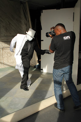
Another work that I was intrigued by was a photo shoot by Hank Willis Thomas. He is photographing Sandford Biggers, who is in a full black and white costume. I have always been interested in the element of contrast, and his arrangement works amazingly. The line separating the colors is nearly perfect when seen from directly in front.



Visual Puns

For this assignment, we were tasked with creating 4 visual puns. We also were to incorporate different techniques in our images. The answers to the pictures are at the bottom of this post.


In this image, I altered the background with Threshold. I replaced a doctor's head with a pepper.


Here I used the Overlay technique. I reshaped the lamp to fit the bulb, and placed both in a garden.


For this one, I used the Gradient Map technique on the man. I also cut out and reshaped the icicles. The background is also misty, which adds to the "cold" feeling.


Here I put together a boxer out of matchsticks and fire. I used the Posterize technique on the background. 


Answers:
1. Dr. Pepper
2. Lightbulb
3. Cold Shoulder
4. Boxing Match

Friday, October 12, 2012

Wordle


For this assignment, we were to use Wordle, a "word cloud" generator, to make a random cluster of words that we chose, and arrange them inside of a silhouette we made. I thought this would go well with an important speech by someone, so at first I picked one of my favorite movies, "V for Vendetta," and took one of the main character's (V's) speeches. But then I realized he uses more words that start with "v" than anything else, so I decided to use only those words. Then for the color scheme, the movie revolves around red, black, and white, so I chose those. For the mask, I made an outline of V's mask by using "Stroke" on a picture of the mask that I edited.

Monday, October 8, 2012

15 Green Things


For this assignment, we were given 15 images that were all different shades of green, and we were tasked with arranging them in whatever order we liked. We could also crop, recolor, and do pretty much anything else we wanted to to them. I started with a picture of a boy, and took his hair to make the leaves on a palm tree. After that, I decided to go with a beach theme. I then cut part of a picture of trees to make the trunk of the palm tree. Then I used the circular part of a meter to make the basic shape of the coconuts. The ocean used to be the wall of a building, then I used the blur tool to make waves. The sand is a stretched-out stone arc. The boat is a car, the mast is from a handicap symbol, and the sail is from an arrow, which I bent. The sun is from a fireworks sign. And the other images are mixed in there as well. I never drew anything new, I recolored and reshaped everything.