Here, we were assigned to create an advertisement, so I chose an iconic fictitious vehicle to display. I also used the font from the same movie that houses the car, "Back to the Future." I cut an oval out of the picture with the car, and faded the edges. After thinking of what to write on the ad, I painted blue smudges behind the text to help make it stand out more. I also added Doc Brown (character in the movie) promoting the car. For the background, I painted random light blue strokes to make it more interesting than a blank white page.
Friday, December 7, 2012
Friday, November 30, 2012
Perfect Kaleidoscope
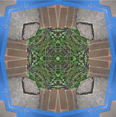
For this assignment, we were to take select a part of an image in the shape of a triangle, and duplicate it several times to create a kaleidoscope effect. In my first one, I found a picture of a butterfly, and used part of its wing and some of the background. For the other, I took a picture of the sidewalk that ran alongside the brick wall and some grass. There was also a blue door.

Thoughts on some photo-editing sites
Photofunia
This site seems to be for inexperienced people who want to lay a few layers or filters on top of an existing picture. There isn't too much you can do with it. I took a portrait of a character, and used these filters to make it look like an old, framed portrait.
Picmonkey
This one also only let you mess with existing images. It seems to give more options towards editing faces, and is simple enough, so someone who just wants to see some cool effects or touch up on a picture might use this. I used an image of V and changed around the lighting and color, as well as adding a "V" on the left.
Pixlr
Pixlr is almost like a free version of photoshop that doesn't have quite as in-depth tools. The ability to freely create a new image or edit an old one was nice. I liked the sketch tool, and tinkered with that the most. Some of the other tools didn't seem to work very well though.
Befunky
As with the first two, you can only edit existing images. However, there are a quite a few different effects you can use on the pictures. It can take a little while to load sometimes though. It's probably intended for the inexperienced, but I found some cool things you could do. Here, I found a picture of one of my favorite trees, (Japanese Red Maple) and darkened the border, popped some of the colors, gave the picture a cartoony look, and made some other slight edits.
Friday, November 16, 2012
Inside/Outside
For this assignment, we were to split something in half, leave one half as it was, and use the other half to reveal what is underneath. I came up with the idea of someone that seemed normal on the outside, but was actually deteriorating underneath. I used a picture of cracked glass and placed the center crack that stretched out across the entire surface where her left eye would be. I also found a green grungy looking background, and recolored it to help the chilling mood.
Friday, November 9, 2012
Marla
After watching the movie, "My Kid Could Paint That" we were tasked with creating a piece of modern art that was similar to Marla's style. I used a black canvas to let the orange stand out a bit more, as well as give the blue a softer color to lie on.
Wednesday, October 24, 2012
ARTnews
Throughout an ARTnews magazine, a certain piece of artwork caught my eye. The artist was Michael Dunbar, and the work was titled, "Twenty-one Twenty." It was a circular metal statue, with a sort of bronze sheen to it. I really liked the abstract industrial theme. I've also always been fascinated by clockwork, and the structure seemed somewhat smilar to clockwork.
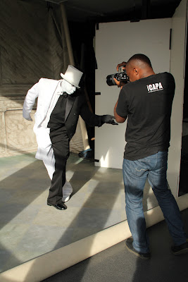
Another work that I was intrigued by was a photo shoot by Hank Willis Thomas. He is photographing Sandford Biggers, who is in a full black and white costume. I have always been interested in the element of contrast, and his arrangement works amazingly. The line separating the colors is nearly perfect when seen from directly in front.
Visual Puns
For this assignment, we were tasked with creating 4 visual puns. We also were to incorporate different techniques in our images. The answers to the pictures are at the bottom of this post.
In this image, I altered the background with Threshold. I replaced a doctor's head with a pepper.
Here I used the Overlay technique. I reshaped the lamp to fit the bulb, and placed both in a garden.
For this one, I used the Gradient Map technique on the man. I also cut out and reshaped the icicles. The background is also misty, which adds to the "cold" feeling.
Here I put together a boxer out of matchsticks and fire. I used the Posterize technique on the background.
Answers:
1. Dr. Pepper
2. Lightbulb
3. Cold Shoulder
4. Boxing Match
Friday, October 12, 2012
Wordle
For this assignment, we were to use Wordle, a "word cloud" generator, to make a random cluster of words that we chose, and arrange them inside of a silhouette we made. I thought this would go well with an important speech by someone, so at first I picked one of my favorite movies, "V for Vendetta," and took one of the main character's (V's) speeches. But then I realized he uses more words that start with "v" than anything else, so I decided to use only those words. Then for the color scheme, the movie revolves around red, black, and white, so I chose those. For the mask, I made an outline of V's mask by using "Stroke" on a picture of the mask that I edited.
Monday, October 8, 2012
15 Green Things
For this assignment, we were given 15 images that were all different shades of green, and we were tasked with arranging them in whatever order we liked. We could also crop, recolor, and do pretty much anything else we wanted to to them. I started with a picture of a boy, and took his hair to make the leaves on a palm tree. After that, I decided to go with a beach theme. I then cut part of a picture of trees to make the trunk of the palm tree. Then I used the circular part of a meter to make the basic shape of the coconuts. The ocean used to be the wall of a building, then I used the blur tool to make waves. The sand is a stretched-out stone arc. The boat is a car, the mast is from a handicap symbol, and the sail is from an arrow, which I bent. The sun is from a fireworks sign. And the other images are mixed in there as well. I never drew anything new, I recolored and reshaped everything.
Friday, September 21, 2012
Crazy Combos
For this assignment, we were meant to use several layers to create a hybrid of several animals put together. I call this, the Incompositus Pengcat. I tried using land, air, and water animals. The scenery is also somewhat impractical to the characteristics of the animal.
I like the result, the animal seems to have quite random and contrasting features.
Music: The Evolving Project
This assignment had us work with the basic uses of Photoshop, mainly focusing on layers. We were given a music note, three musicians, two backgrounds, (one tie-dye, the other graffiti), and a layer with several colored strips. I thought of arranging the layers into what looked like a poster for a concert, or maybe auditions for a band. When I moved the colored strips into a vertical position, it gave me the idea for placing the musicians into the columns, and making a poster. I also tried to use contrast to make the musicians stand out from the strips. I distorted the lines a little to match the tie-dye background.
I'm happy with the final result, although some of the layers seem a little pixelated.
This was the second part of the assignment, where we use the background that we didn't use for the first part. I thought of making the strips look tattered this time, and positioned them so they looked like they were almost taping over some of the graffiti'd area. Again I used contrast to make the musicians stand out from the different colored areas. This second part is more gritty or worn-down than the first.
I also think this one turned out well, but again, some layers seem somewhat pixelated
Subscribe to:
Comments (Atom)


.jpg)


